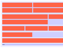
The Rebar Grid Framework is a responsive grid available in SASS & Stylus. There's no CSS version included with the download, but you can easily compile your own if you need one.
This small utility was created to help developers working on Web pages that need to render on a wide variety of devices at different screen sizes.
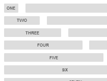
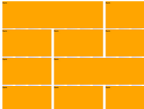
Using a classic self-adjustable column-row system, Rebar will move your content cells around based on the page's current free space.
At the top of the grid's source code files there are a few settings you can tweak, settings addressing the grid's maximum width, the available breakpoints, gutter sizes, and if to activate the mobile-first behavior by default.
The same settings are available for both the Stylus and SASS versions.
Requirements:
- SASS 3.4 or higher
Comments not found