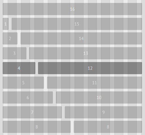
Lost Grid explores the new calc() CSS function and finds a good way to put it to work in a responsive grid system.
The grid is available in three versions, JavaScript (jQuery dependency), SCSS, and Stylus, and you can easily compile it into a fourth version: native CSS.
The grid's markup mimics Bootstrap's grid, allowing developers to easily add it to their future projects without altering too much of the HTML.
For older browsers, Lost Grid also uses a fallback grid based on Jeet, avoiding situations when the content breaks and gets displayed in all the bad places.
The grid also uses consistent gutters, doesn't include additional ratio contexts, and is very light and easy to implement compared to other solutions.
What is new in this release:
- Port to PostCSS.
- Remove Stylus, SCSS, LESS versions.
What is new in version 6.6.2 / 0.0.7:
- Port to PostCSS.
- Remove Stylus, SCSS, LESS versions.
What is new in version 6.5.0 / 0.0.7:
- Port to PostCSS.
- Remove Stylus, SCSS, LESS versions.
What is new in version 6.3.0 / 0.0.7:
- Port to PostCSS.
- Remove Stylus, SCSS, LESS versions.
What is new in version 5.1.3 / 0.0.7:
- Fix waffle() at various breakpoints by resetting margin-bottom.
- Fix row() at various breakpoints by setting width: 100%.
What is new in version 5.0.0:
- Convert block() to column(), row(), and waffle().
What is new in version 4.0.0:
- Fix all kinds of things
- Remove dependency on $cycle for sizing
- Made grid insanely awesome
What is new in version 3.0.4:
- Added move() back in but it doesn't work very consistently.
What is new in version 2.0.2:
- Fix how vertical grids handle width. width: 100% was pushing the edges of elements off the sides (could see this on borders).
What is new in version 1.0.0:
- Make work with custom settings.

Comments not found