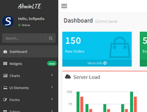
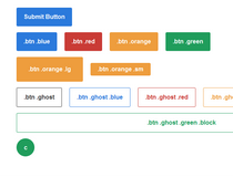
Material-UI lets developers easily put together the frontend of an application using a series of ready-made components and some industry known best practices.
While there are many frontend UI frameworks around today, this particular one addresses the world of React developers that want to code using Google's famous Material Design specification, a series of guidelines released by the company's design team to help with developing more user-friendly mobile (and desktop) applications.
Besides the built-in components, Material-UI also comes with support for all of Material Design's recommended color palettes, and with an easy to follow typography ruleset.
All of these will help with developing more beautiful, user friendly, and responsive applications. Yes, the framework is also responsive!
What is new in this release:
- Fixed a bug that caused checkboxes and toggles to not uncheck.
What is new in version 0.7.3:
- Fixed a bug that caused checkboxes and toggles to not uncheck.
What is new in version 0.7.0:
- Fixed a bug that caused checkboxes and toggles to not uncheck.
What is new in version 0.5.0:
- Added a snackbar component.
- Removed lesshat dependency. Be sure to change your build process to include an autoprefixer.
- Ripple animations are much faster now. The animation starts onMouseDown or onTouchStart and completes onMouseUp or onTouchEnd. Now we can spam buttons all day long.
- Spacebar key up triggers button clicks.
- Changed slider cursor.
Requirements:
- JavaScript enabled on client side
- React
Comments not found