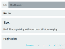
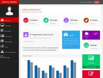
Software Screenshot:
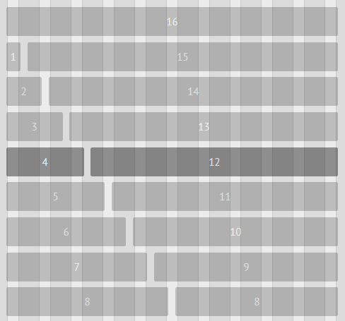
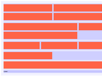
Based on the 960 Grid System, Gridlock is for developers that want to build Web pages that can seamlessly be viewed on desktop, tablet and smartphone devices the same.
Gridlock revolves around a 12 and 16 column system, that resizes and moves columns around as the viewport width is changed.
The entire system relies mainly on CSS, with absolutely no JS involved.
What is new in this release:
- Adding X-hide classes for hiding elements at specific sizes;
- Adding mobile-fluid mode (fluid only if <= tablet size);
- Adding fluid mobile demo.
What is new in version 3.1.2:
- Simplifying file structure
- Fixing regression in 'centered' class
- Converting to silent LESS comments
What is new in version 3.0.4:
- Fixed nested contained row.
What is new in version 3.0.2:
- Fixing main file group.
What is new in version 1.3.1:
- Fixing "all-" classes.
What is new in version 1.2.1:
- Adding contained push styles.
- Fixing cell push bug.
- Comments.
What is new in version 0.2.0:
- Added mobile first variants, 12 and 16 column.
Comments not found