New UI and CSS Frameworks for Web
Built around CSS3 Media Queries, One% CSS Grid is a modern grid systems for browsers that support CSS 3.Because it uses percentages rather than fixed point or pixel sizes it automatically has mobile support, resizing in real-time to fit the available...
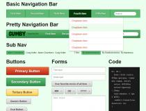
Modeled around a 960px wide grid system, Gumby is perfect for the modern day responsive design.Includes templates for a 12 column grid, 16 column grid and one based around the Hybrid grid system.Features:HTML 5 support
CSS 3 support
Included PSD...
Adam Kaplan's Grid is a lightweight grid system created to allow developers to code page templates that render properly on all kind of devices, regardless of their screen size.While in the ancient days of the Internet only desktops were used to browse...
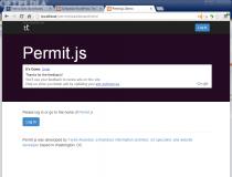
Permit.js uses a cookie-based system to store the user's permission level when viewing an application's prototype, boilerplate, or mock-up.This allows developers and designers working on a product to preview various application features without having to...
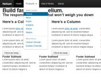
Helium is a responsive frontend CSS framework, inspired by Bootstrap and Foundation.It was initially created to power the fundrise.com website, but it is versatile enough to use with any Web design project.Features:Responsive design
Uses Sass and...
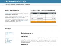
The Cascade Framework is a well-designed CSS framework for quickly prototyping and deploying frontend user interfaces with many built-in components and styles.The Cascade Framework Light version is just Cascade's CSS normalization tool, along with all the...
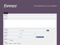
It eliminates the need and time spent on aligning fields, calculating margins and padding for forms.Form field alignment is based on the Fluid 960 Grid System.The form was built with care to preserve web standards and their semantic values, working...
Ribs is an evolution of the famous Skeleton mobile-first CSS framework, a tool loved by most designers, but which has become inactive for quite some time now.Ribs adds support for newer development techniques and coding patterns, allowing programmers to...
BlankPlate can be used when needing to start a new Web project, but using a full-on frontend UI like Bootstrap, InK, or Bootflat is a little bit too much. BlankPlate is organized in a well-thought off structure and made up of a basic CSS reset, a basic...
BareGrid uses percentages to define column sizes, and by doing this making sure content resizes along with the available screen size.The grid is based on a basic 12-column layout, but content can be spanned across multiple columns, and pushed or pulled...