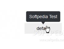
Angular Tooltips provides an easy way of adding a tooltip component system to your page, showing beautiful speech-like bubbles when specific elements are hovered with the mouse.
The component includes cross-browser support and is extremely easy to setup.
Developers can control the tooltip's position relative to the hovered element, from where to get the tooltip's title and content, its size, and how fast to show the load/hide tooltip display animations.
Tooltips can also be shown on click or on mouse hover, and they can be automatically re-positioned if the tooltip's margins go out of the screen.
Examples and usage instructions are included with the Angular Tooltips package.
What is new in this release:
- If tooltip is empty no need to show it.
What is new in version 1.0.6:
- If tooltip is empty no need to show it.
What is new in version 0.1.9:
- If tooltip is empty no need to show it.
Requirements:
- JavaScript enabled on client side
- AngularJS 1.2 or higher
Comments not found