Software Screenshot:
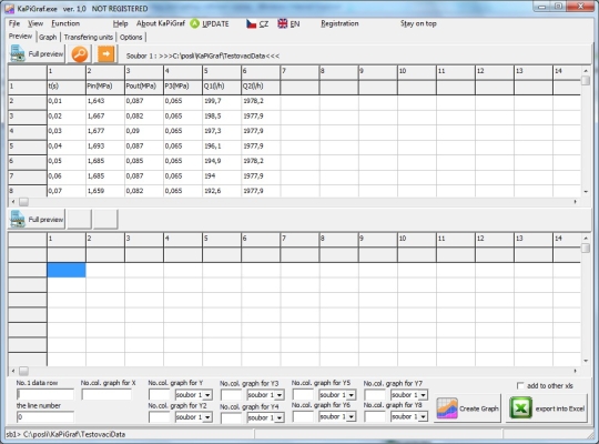
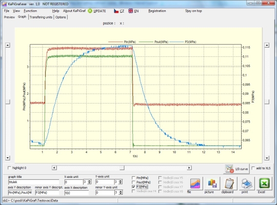
KaPiGraf shows your data as a chart easily and quickly. It also offers possibilities which you miss in MS Excel. After you open your file, you will see the preview of your data. Here you will choose each column which stands for the axxis X and Y. After clicking the create graph, the graph is automatically drawn. This graph can be used in many ways: moving, zooming, changing parameters, exporting into MS Excel, printing, saving, and transferring units.
What is new in this release:
Version 1.8 has added to the status bar number of the plotted data.
Comments not found