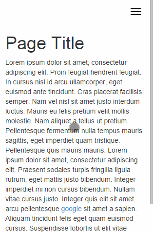
Bootstrap Offcanvas is noticeable only on small screen devices, when there isn't enough space to show the normal menu's navigation bar.
When this happens, the entire menu is hidden under a hamburger icon (☰), which when clicked makes the menu appear from the side of the page, but in a vertical layout.
This menu can be shown from both left or right side of the page, and can easily be styled via CSS-based skins.
Support for touch-based interactions is included, making the plugin usable on both mobiles, tablets, and other small screen, touchscreen devices.
The plugin was created to work solely with the Bootstrap Navbar component.
Bootstrap Offcanvas comes with a sample page to show developers how it can be implemented.
What is new in this release:
- Changes breakpoint to work correctly on iPad
Requirements:
- Bootstrap
Comments not found