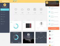
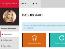
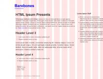
Skeleton was built around responsive design principles, supporting every type of page and device, ranging from big LCD TV screens down to small mobile devices.
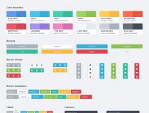
The framework is not a frontend UI package, coming with no special UI widgets and components, just the basic styles for most common HTML elements, a grid system and basic media queries to make sure everything lines up in the right places at various resolutions.
Skeleton, even if rarely updated, has become a community favorite amongst the Web design community, and has been integrated in many projects, themes, templates, and official websites.
The Skeleton project is very well documented, a small detail that has contributed to its immense success.
A default working template is included with the download package.
Features:
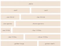
- Grid Layout
- Typography
- Buttons
- Tabs
- Forms
- Media Queries
- Display modes:
- Smaller than 960: Smaller than the standard base grid
- Tablet Portrait: Between 768px and 959px
- All Mobile Sizes: Less than 767px
- Just Mobile Landscape: Between 480px and 767px
- Just Mobile Portrait: Less than 479px
- Browser support:
- Latest Chrome (Mac/PC)
- Firefox 4.0, 3.6, 3.5, 3.0 (Mac/PC)
- Latest Safari
- IE9, IE8, IE7
- iPhone (Retina)
- Droid (Charge/Original)
- iPad
What is new in this release:
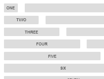
- A new truly responsive grid based on percentages
- Mobile first media queries
- New typeface Raleway as default
- Generally simpler style
- More robust forms (especially in relation to grid)
- Inclusion of basic table styling
- Inclusion of super basic code styling
- Using Normalize.css as the "reset"
- Removing Apple touch icons
What is new in version 1.2:
- Removed tabs and all JS.
What is new in version 1.1:
- App.js is now just tabs.js.
- Tab CSS now works perfectly on IE7+.
- Rewrote layout.css media-query spaces to be easier to understand.
- Stripping some rogue whitespace and reformatting a bit.
- Fixing broken Doctype declaration.
Requirements:
- JavaScript enabled on client side
- CSS3 enabled browser
Comments not found