jQuery Responsive Lazy Loader is the lazy-loading system modern Web development needed.
Because users utilize so many devices to access the Internet and the fragmentation of CSS code via media queries and responsive breakpoints, developing a website that renders optimally in all mediums has become a labyrinth of death, with bugs and bad practices waiting for you at every corner.
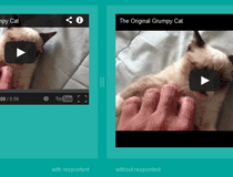
Loading images is a stone weighing down page load times, with large quality photos being loaded when they shouldn't, or crippling content quality with low-res imagery being shown on high-res screens.
The jQuery Responsive Lazy Loader plugin is a way to load the proper image, in the proper case, and only when it comes visible on screen.
The plugin basically adds CSS media query support to classic lazy-loading systems, making them aware of the current screen resolution and then loading an image appropriate for that scenario.
This means you can load Retina images on Retina-only devices, low-res imagery on mobiles, and high-quality photos when the current used media query tells you the user is using a larger screen.
All in all a must-have tool for developers working on the convoluted world of modern-day Web development.
A basic demo and usage instructions are included with the plugin's download package.
What is new in this release:
- Allow to override windowView function to allow developers to deal with custom positionning.
Requirements:
- JavaScript enabled on client side
- jQuery 1.3 or higher
Comments not found