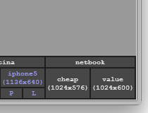
Software Screenshot:
jQuery.Resolution is for the modern developers that create responsive websites that use the same codebase to render on desktop and mobile devices.
This small jQuery plugin works by adding a toolbar in the bottom right corner of the page with various preset resolutions and orientation modes.
The rest of the page is wrapped in an iframe and when the user clicks one of the resolution presets, the iframe is resized to those specific settings.
The jQuery.Resolution presets can be easily extended with new values, so developers can test for whatever device display they want to.
A demo is included with the download package.
What is new in this release:
- Initial resolution can be defined.
- Some minor issues fixed.
Requirements:
- JavaScript enabled on client side
- jQuery 1.5 or higher
Comments not found