Free Mobile Development Tools Scripts for Web
The Unified mouse and mobile touch input events plugin, or simply jquery.event.ue allows developers to create and run apps and websites that render and behave the same on both mobile and desktop environments.
This means less code to write and maintain...
Titanium Mobile takes JavaScript code and compiles it to native executables, based on the platform the app is destined to run on.This gives JS developers more versatility when writing their code, letting Titanium Mobile handle all the platform...
rIframe reads the user's viewport size and adjusts the size of all desired iframes on a page, making sure they fit right in the user's screen.The plugin is ideal for deploying on mobile versions of a site, making sure data doesn't go off-screen and the...
Response JS was created with the goal of simplifying development on mobile devices, with second-grade desktop support included.Response JS revolves around HTML 5 data attributes, which enable developers to pass various loading and display criteria to each...
Shifter includes support for both mouse and touch gestures.All Shifter open - close animations are handled via CSS 3.What is new in this release:Fixed gruntfile.
What is new in version 0.0.2:Fixing overflow bug in Webkit.
Requirements:cursor-pointer"...
At around 107 bytes (minified), Fluidity is probably the World's smallest responsive CSS framework.Easy to use and easy to deploy, adding Fluidity to a Web project allows developers to support devices at any screen size, every element in the design...
gestureKit works as a transparent layer above any application's interface.Developers can code this layer once and apply it to various versions of their app, regardless on what platform they work on (iOS, Android, Web).Using this approach to supporting...
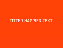
Fitter Happier Text works by reading the user's viewport width in real-time, calculating the font size a text needs to be displayed to perfectly fit inside the screen and then displaying it using a SVG object.When the browser is resized or the text is...
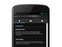
Just like Ratchet was at first a frontend UI framework for developing mobile apps in HTML, CSS, and JS that utilized an iOS-like graphic package, so is Fries, but using Android-like widgets. In the meantime Ratchet development has been taken over by the...
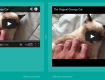
jQuery.respontent is for designers that totally bought in the new Responsive Web Design (RWD) trend.The plugin can help them transform a bland, fixed, static Web page into a fully-working responsive site.As the user will resize his browser, or if the page...