Best Mobile Development Tools Scripts for Web
Spring Mobile comes with a few mobile specific modules.
These include support for detecting user devices, detecting the device's resolution, managing user preferences, and a theme switching mechanism.
This extremely useful package can be used without...
Mobify.js is more of an adaptation framework, for adapting HTML, CSS and JS code to render differently (and above all correctly) on mobile, tablet or other handheld devices.It solely relies on code written for the desktop version and does not force...
Compatible with iPhone/4/iPod-Touch and iPad, iOS >= 3.1.1.To use, just include the script and stylesheet in the head section of the desired page.The script in also available in many international languages: Catalan, Danish, Dutch, English, French,...
FooTable allows developers to create HTML tables that render gracefully in desktop and mobile devices as well.Whenever the viewport size is too small to properly render the table columns and their content FooTable comes into action by hiding unimportant...
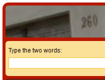
responsive reCAPTCHA is a CSS stylesheet that you'll need to load on pages where you're using Google's reCAPTCHA field.This file will change how the CAPTCHA field is displayed, allowing it to resize along with the page and always remain visible and...
If the user taps on the screen of mobile devices, Safari interprets the gesture as a mouse click.This class adds support for the unsupported events as mousedown, mousemove, and mouseup.Mouse2Touch does this by mapping mouse events to touch...
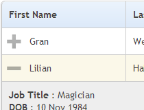
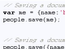
The library can be used on Webkit mobile apps in need of simple, small and elegant persistence.Features:Clean and simple object-oriented design with one database table per store.
Key/value store. Specifying a key is optional.
Micro tiny storage without...
Data Img uses a simple image replacement technique, hiding the previous image and showing a new one based on the browser's width.The plugin uses a series of preset responsive breakpoints to detect when's the appropriate time to replace the served image...
jQuery.Resolution is for the modern developers that create responsive websites that use the same codebase to render on desktop and mobile devices.This small jQuery plugin works by adding a toolbar in the bottom right corner of the page with various preset...
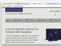
FlexNav will convert regular menus into a drop-down select option every time the page is viewed from a small viewport, tablet or smartphone device.It heavily uses CSS 3 media queries to detect screen size and utilizes jQuery to convert the regular list...