jQuery Mobile tabview 0.3.0
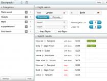
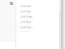
Tabview can be used in creating complex tabbed panels.Supports both vertical and horizontal panels.A demo is included with the download package.What is new in this release:Fixed content...
Tabview can be used in creating complex tabbed panels.Supports both vertical and horizontal panels.A demo is included with the download package.What is new in this release:Fixed content...
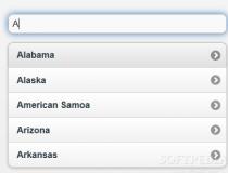
Loved by users and developers alike, autoComplete.js fields normalize text field input by reducing the amount of characters needed to type in a value.Instead of permitting the user to enter the entire word, as the visitor is typing in his word, input...
This ASP version of MobileESP was ported from the original PHP version. It keeps as much of the original code intact, and can even be used with VBScript projects.The original MobileESP project can be downloaded from Softoware as well.What is...
Funf enables programmers to collect and use data from remote Android devices.After collecting the data, Funf can optionally forward it to a remote location/URL for analysis and interpretation.Features:Remote Configuration Security Extensibility Reliable...
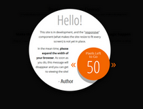
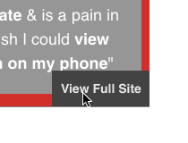
Responsible.js works by adding a small toggle to the bottom right corner of the page, which can switch the user's view back to the desktop version if he doesn't like the mobile variant.If switched to the desktop version of a mobile device, the user also...
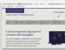
Breakpoints in Web design are viewport (screen) widths.They are essential values for a Web developer because they can let him know when the site is being viewed from a desktop computer, a laptop, tablet or smartphone.BreakPoint, the JavaScript library,...
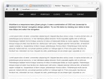
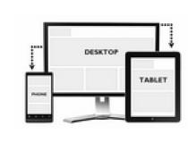
Responsive HTML tables draw their name from the 'responsive design' principle, a design pattern that refers to Web pages and Web-based apps that render the same on mobile and desktop devices, using fluid layouts that shift around to fit content in...