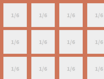
Crow was created to help out with creating responsive layouts, layouts that shift and adapt to fit the user's current viewport size.
Content on columns is shifted to the underneath row to fit inside the screen vertically, avoiding situations on mobile devices where the user needs to scroll laterally.
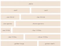
The entire grid is very configurable, allowing developers to control the number of columns percentage-wise, the gutter size, and even height details.
The grid can be used for the entire page's content, or used with smaller elements like sliders, tab panels, and various other page components.
Along with the grid itself, Crow also includes an additional vertical & horizontal centering utility, that helps developers automatically position content in the column's absolute center.
Requirements:
- Stylus
Comments not found