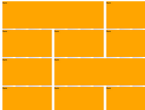
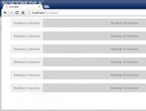
Software Screenshot:
Software Details:
Version: 1.0.3
Upload Date: 13 Apr 15
Developer: Yann Gouffon
Distribution Type: Freeware
Downloads: 11
Agrid.css is available in CSS, LESS, and SASS (SCSS) versions.
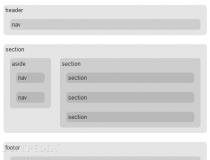
The magic happens in the SASS and LESS versions, where at the top of the grid system file, there's a special configuration section which developers can edit to create their own grid systems.
Developers can edit the number of columns, the presence of gutter, the ratio between a column and the gutter, the grid max-width value, and the currently available media query breakpoints.
Once all these options are setup, the developer can compile his file and have his own custom responsive grid system.
Adding the grid columns in the HTML source uses the same syntax found in Bootstrap, so it should be pretty easy to setup and get off the ground.
What is new in this release:
- Fixed missing media queries class.
Comments not found