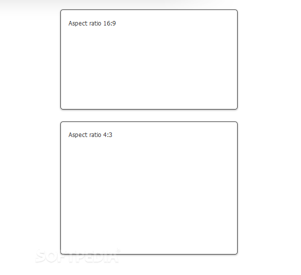
useful.aspectratio.js can be used to force page elements to render at certain aspect ratios.
The library can work with any aspect ratio you want and does not rely on pre-configured ratios like 16:9 or 4:3.
Developers can pass it any type of ratio, ranging from standard settings like the ones above or weirder options like 1000:1.
Since useful.aspectratio.js calculates the element's dimensions at a preset time interval, programmers can also use it on responsive or mobile layouts as well, the library making sure items are properly displayed and media queries won't ruin page alignments.
The library can be used for multiple elements on the same page, and can also work with offsetting margins.
A demo and usage instructions are included with the download package.
Requirements:
- JavaScript enabled on client side
Comments not found